PhonePe · Case Study 01
Masthead Visual System
A scalable masthead language that flexes across payments, investments and commerce — while staying unmistakably one brand.
- Client
- PhonePe
- My role
- Led the visual system & masthead language
- Surface
- In-app merchandising
- Disciplines
- Visual systems · Brand · Motion
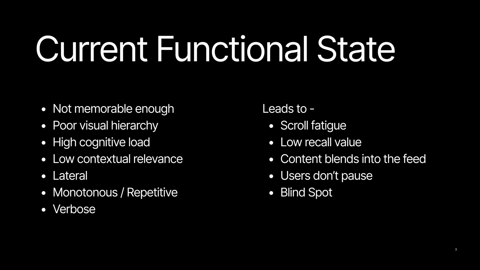
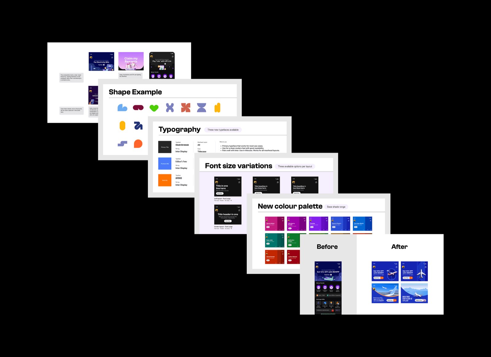
The PhonePe masthead visual revamp was initiated to bring a fresh, story-led approach to in-app merchandising and create a more cohesive brand expression. The goal was to move away from repetitive, text-heavy creatives and address key challenges like low memorability, weak visual hierarchy, high cognitive load, and lack of contextual relevance.
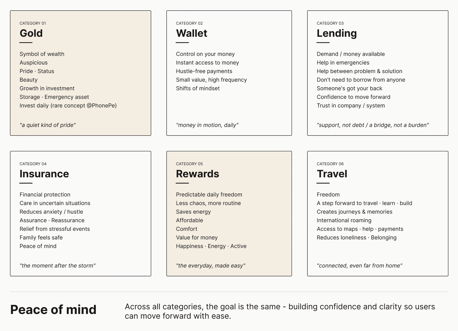
This project focused on creating a scalable visual direction, guided by emotional mapping, to make communication more engaging, intuitive, and impactful.
The problem, stated plainly
- Not memorable enough — low recall value
- Poor visual hierarchy — users don't pause
- High cognitive load leading to scroll fatigue
- Monotonous and repetitive — content blends into the feed
- Low contextual relevance — a blind spot in the journey
Here is a snapshot of the research — happy to walk you through it in detail.
The visual system
NEXT PROJECT
Share.Market — Mailer Automation →